 Contrast:
Contrast can be both a merit and shortcoming in its usefulness as a design aid. Depending on its location, contrast can create interest, and “showcase” an image by making it stand out. You can achieve contrast through colour, size, texture, and age. Too much contrast can distract the v
iewer, thus making the image lose its appeal.
This picture portrays contrast through many different aspects: the age (young, and old), the size (small and large), the texture (smooth, and wrinkled/veined), and the grip (strong and weak). This picture also portrays proximity in that there is a strong link the two people share since the little hand is engulfing the old person’s finger.
http://www.jamesadonis.com/images/old%20young%20hands.JPG
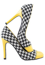
Repetition:

Like contrast, repetition can improve or detract from a
design. Repetition reinforces the message. Usually the repeated image has variation rather than being a total clone. This helps to keep the attention and interest of the viewer, otherwise the design could become monotonous. Too much repetition can cause the image to lose its bold impact, since it is no longer unique. The message behind the image may get hidden.
Alignment:
Alignment can be a positive or negative design tool, depending on how you align the images. Left or right alignment is easier for the brain to process than center alignment. Too much alignment, and similarly, too little alignment can cause the design to look messy and unorganized. You might move an image or text out of alignment to draw attention to it, therefore making it a focal point.

http://katalyst-marketing.com/blog/wp-content/uploads/2008/11/faceprofileorvase.jpg
Proximity
Proximity establishes a link among images depending on how close or far apart you position them; the closer the images, the stronger the connection; the farther apart the images, the weaker the relationship. When the images are close together, it's easier to comprehend the design.

http://i.ivillage.com/E/325/2008Oscars/E_GeorgeClooneyGirlfriend_3.jpg
No comments:
Post a Comment